"The jury has given a $380 million verdict. The highest in history!"
"The New York Public school janitor has the highest salary in school janitor history!"
Which of these statements is grossly disproportionate to harm? Ok, ok loaded question, I know. . . How 'bout this? Which of these statements can blame be placed on few people . . .? Maybe even one person? I know, loaded again . . .
 I bet I know your answer depending what hockey position you play (left wing, right wing, or center [if you don't play hockey I'll base it on which news show you watch]). Most right-wingers (or Fox News adherents) will say statement one shows sole culpability. Most left-wingers (or MSNBC devotees) would say statement two is grossly disproportionate (unless the verdict is against a mean ol' corporation). Before you let me box you into a stereotype that you publicly resent (and privately fit), think about these two factors that affect all three statements: 1) inflation and 2) inflation.
1) Inflation: My first class in undergraduate school was "Statistics for Political Science." I was seventeen and remember little. Two of the few things I remember are the "f" of "x" portrayed as f(x) and statistical inflation (I don't remember what f(x) actually represents but the pronunciation "eff-of-ecks" is solidified forever). Statistical inflation can be achieved easily on a bar-graph.
If I have two statistics on a x/y axis I can make one of those seem visually greater by magnifying the graph.
For instance, I ate 7 cookies and you only ate 5 cookies. If I display this on a graph with the upper limits of the y-axis at 15, distributed in 1 number increments, the difference between my 7 and your 5 will look very small.
If I change the upper limit to 8 with a distribution of 0.25 your 5 cookies will now look 12 points lower than my 7, instead of the original 2 points with lower magnification. These graphs next to each other will show my 7 cookies much "farther" away from your 5 cookies on the magnified graph with an upper limit of 8. (This can also be amplified by starting at a high ordinal. Instead of the x-axis beginning on 0, start on 4 and see how "low" your 5 looks. Keep this in mind for later).
2) Inflation: Financial inflation rates impact nearly every aspect of our lives. It helps determine our minimum wage, the price of our cars, the price of our homes, and amount of our jury verdicts. In 1980 the inflation rate was over 13%. 1981 gave us a rate over 10%. Between 1988 and 1999 the rates bounced from over 5% down to 2%. The inflation rate coupled with the power of your country's currency will dictate how much your milk costs compared to 1965 (this is a gross oversimplification of the Consumer Price Index but it should depict the idea).
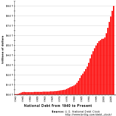
We all know that a bag of groceries cost more today than it did in 1965 and we don't think twice about it. Newspapers don't exclaim, "Milk costs 3.65 a gallon! This is the most it has EVER cost!" Why then, do they exclaim that "Obama has brought us the highest national debt in history"? Actually, no president has had a lower national debt than their predecessor. When Eisenhower was president in 1953 he brought the debt to a historically high $266 billion. Up from $259 billion under Harry S. Truman. When Bush took over for Clinton, he too had the highest national debt in history. For a better gauge of our president's fiscal stewardship, maybe we should look at how much the president added to the debt (remember the starting point for the x-axis) when considering the power of the dollar, the CPI, and inflation rates.
To make matters worse, janitors are making more today than they ever have . . . and frankly that's disgusting.